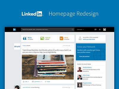
Yet Another LinkedIn Redesign
Yeah, I know, yet another LinkedIn redesign. Sorry, but I just couldn’t resist not to make some UI polishing. I didn’t really touched the UX part, because I believe they got it right, and moreover I don’t have the UX insights they have, so I’ll simply rely on trust.
The most crucial change is the main navigation, where I propose bigger focus on the search and less focus on the navigation items. I only put a magical “Discover” link, where it reveals a wide array of sections, which can change from user to user, based on user tracking from their involvement into the LinkedIn eco-system.
The rest is more-or-less some polishing in a direction so the interface looks less corporate and more personal. I also prefer the pitch black from their corporate color tones, instead of that grey gradient that is in use on their current platform.
So what do you think, would this design direction seem as a next logical step and entice LinkedIn stakeholders for a little UI refresh?
P.S. By the way, the whole layout is based on an 8-point grid. Thanks to @Elliot Dahl who convinced me to shift by reading his Medium article.
———
You are always welcomed to visit my official portfolio or check out my biggest side project.


