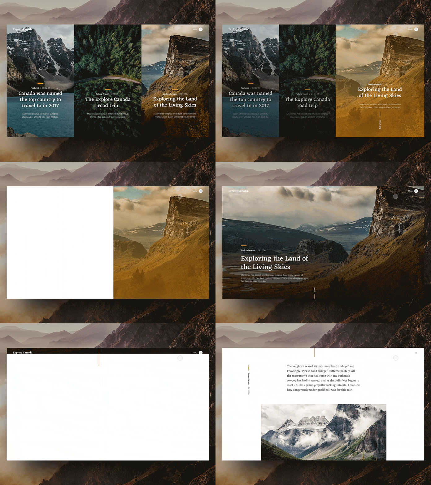
Split Screen Navigation Concept
Early animated prototype about my testings with new Font Combinations. I really like the idea of adding some transitions between pages. This makes the site in subtle way more attractive and alive. In this case – designing a modern travel/photography blog with huge mood-images – i think this could be pretty nice and kinda pleasant for the user.
What do you think?
Press „L“ to show some love.
Have a inspiring week.
Thanks,
Simon
________
explore_canada-split-screen-sk.mp4
6 MB
More by Simon Kratz View profile
Like
