Wedding Stationery
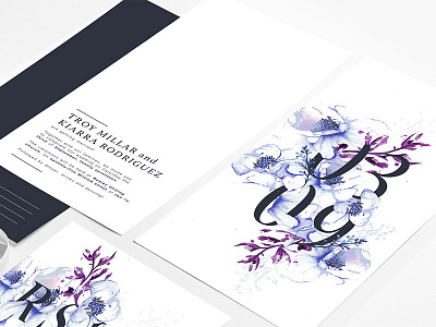
This stationery package was designed specifically for Kiarra and Troy to celebrate their special day, embracing a floral theme to tell the story of how they met in the Spring. Their outgoing and youthful personality was vividly reflected through the conversational tone of voice used throughout all collaterals, speaking to the readers directly to connect on a personal level.
The design radiates a sophisticated, classic, yet modern image of the couple that is projected consistently through each element. Watercolours were used to create a soft and transitioning effect against the white paper, leading towards a clean and minimal aesthetic that mirrors modern practices.
Check out the rest of the project here! www.behance.net/gallery/43208869/Wedding-Stationery
Feedback most welcomed :)
