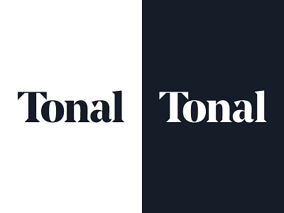
Tonal positive + reverse
This is not the same as that: for Tonal's logotype I made positive and reversed versions in order to counteract the screen-based phenomenon known as irradiation. Irradiation causes light objects on dark backgrounds to appear fatter than they actually are. By manually thinning out the letters just a touch, spacing them out a little more, and tweaking a few of the joints, I was able to ensure consistent appearance.
More by Matt Steel View profile
Like
