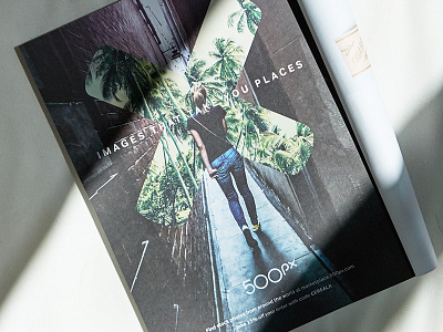
500px Ad
I had nothing to do with the sweet design of this brand and ad (that was @Chase Turberville and @Alex Sailer, respectively) my role was to photograph the magazine. Because of the complexity of the textures within the ad I needed a simple background. BUT simple was also bland, hence why I decided to use light to make the image more interesting.
What would I change about the shot?
If I could do it again I'd line of the shadow with the X within the design. Not a mistake; it's a learning opportunity.
____
Looking for a creative agency? We would love to hear from you. Email us hello@focuslabllc.com
More by Focus Lab + Odi View profile
Like
