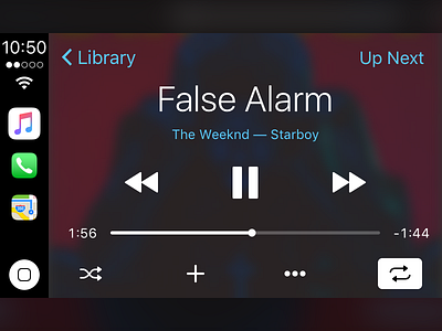
iOS 10.3 CarPlay Status Bar
I've been playing around with the iOS 10.3 beta, and there are a lot of cool CarPlay changes, but the one that makes me really confused is the status bar. In the first beta it was moved from the center of the view to just above the home button. This is not a great placement because it makes it difficult to find, and most people read from top->down (no matter if the language is left to right or right to left). By moving the status bar to the top, the new dock of recent apps can rest in the center allowing for screens that may be taller over time to accommodate more apps. This helps scale the interface well as it ages. Furthermore, CarPlay currently has no way of getting to the top of a list (or tableview/collection view), but by keeping the status bar at the top and making it recognize touches you have a familiar phone behavior now available in the car! Typically the clock sits at top, and this just makes the whole experience feel more robust and efficient.
In the case of Wireless CarPlay, a battery indicator is added to the status bar and that I would place above the home button. It is a non-obtrusive and passive indicator that may not apply to all scenarios but also has never been actionable.
This concept design then satisfies the following behavior patterns:
1. People on iOS typically see a clock at the top of the screen and a home button on the bottom. This aligns with that paradigm.
2. The app switcher sits at the center allowing for more apps to be included over time as car displays get taller (maybe 4 or 5 icons in some portrait sized displays)
3. People who are accustom to tapping on the time to get to the top of a list can still do so in a clearly designated region that is familiar to them.
