Texas Rangers (soft) Re-Design
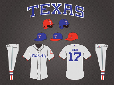

Here's a fun little project. Rebranding my hometown team. Borrowing from the mid-80s Rangers "TEXAS" across the chest in a simple, clean sans serif type treatment. Included are newly designed numbers and an updated "T" which is a mix of old and new.
Be sure to check out the attachment for a juicy 3000px by 2250px look at the details and subtle design choices.
