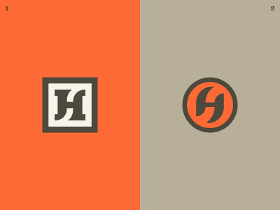
HSco. - monogram 02.5
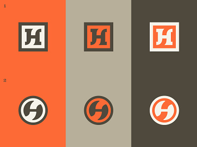
Made some adjustments to this concept.
In #1, the negative-space S is thicker.
In #2, the negative-space S is thicker, and the H conforms completely to the roundel. It now has a sort of yin-yang vibe, which isn't a bad thing.
Questions: Which do you guys prefer? Also, have I pushed #2 too far with respect to the circular-ness of the H? Here's the old one for a refresher.