Beneath Rejection Homepage - V2 (FINAL!)
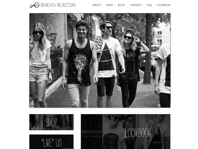
Here's an update to the homepage. We ditched the slideshow, ditched the 3 buttons below it and revamped it with 1 large image and a unique 3 button style layout below.
I approached Beneath Rejection with this idea for revamping it as I thought it brought a lot more originality to the site and broke the mold of normal "simplistic" sites. Hopefully everyone else digs it as much as us :) This site is currently being launched and I cannot wait to show it off!

