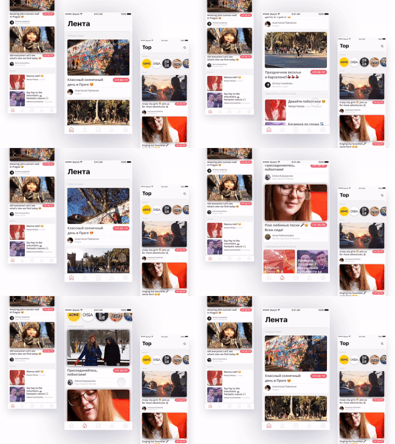
Streaming Feed and Top
A concept of a news and a top feed for a streaming app. I experimented with a visual separation of live streams and replays. The main focus of an app is on live streaming, therefore live previews take the majority of the screen space. I decided to place the title and streamer info underneath the previews in order to make a picture look clear and avoid any distractions. Also, I toned replays with a color, made them smaller than live previews to emphasize the hierarchy. For more details watch this video https://vimeo.com/201870730
More by Elena Kukushkina View profile
Like
