Credit Card Checkout - Daily UI 002
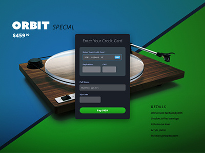

Day 2: The idea I had for this credit card form was to have a simple, but elegant overlay on a landing page with clear inputs from the user. I was torn between a light or dark color form but ended up choosing a dark tone to match the mood of the landing page. Please share any and all thoughts. Thank you in advance!
