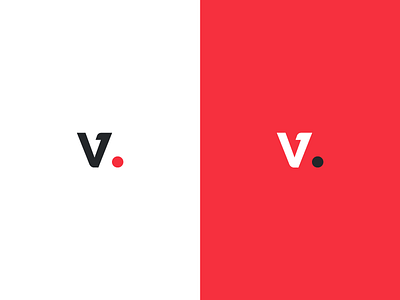
v Logo Final
This will be the final Logomark of a branding-project I'm currently working on. The client wanted it to be as minimal as possible and to be the initial letter. The bottom left corner is rounded to give it a more unique and harmonic look. The colors are final too.
What do you think?
–– I am available for new projects
and I would love to hear from you.
E-mail me hello@tchgrbr.com
More by Felix Teichgräber View profile
Like
