E-Clinique
So here's where this one is going. :)
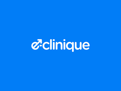
I've been working on how to align logotype inside the box. Due to the number of elements reaching the cap height, I was surprised to see it works better if I centered it vertically with the Baseline to the cap height rather than with the elements between the baseline to the x-height.
I wanted the male symbol and the blue color to make it clear that this is addressed to men. Since this clinic cures erectile dysfunctions, I figured the arrow of the male symbol worked perfectly to represent an erection. All of this is also used as the first letter of the name: E-Clinique.
Since it's a WIP, there's more about this on the way! :)
This is created for the Virus Media agency.
Don't forget to hit that "L" key :-D