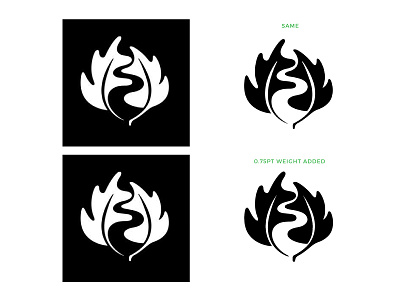
Which Do You Prefer Better?
I was just watching tennis and got amazed of Jacob Greek's new white logo. Then I went to their website to see the logo and my it got my eye when it was as black. I've always thought that you should add more weight to a logo when it's on white because of how our eyes are designed to see. That doesn't seem to be the case here.
- Upper-right is the original
- Down-right has 0.75pt of line-weight added to it
Which one you prefer more? I think down-right seems much more similar to the one on black.
You can actually see it on their webpage. In the header it's as black and on the footer as white :)
More by Mats-Peter Forss View profile
Like
