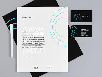
Stratosphere Stationary
Here's some of the peripherals for Stratosphere. I went back and forth on using the black accent so heavily, but in the end decided it was the best fit for the company.
Stratosphere is a lighting design and production company so the darkness works to imply the company's product — "lighting the darkness" — and the bright blue cuts through it like light. I find that it's always more important to put the "why" over the "what." In the end it helps us communicate the company's value when we put aside our designer preferences for the sake of clarity in propelling the vision.
If you want to reimagine your brand or build something new together, let me know at jacob@morrisondesign.co!
More by Jacob Morrison View profile
Like

