HC-One
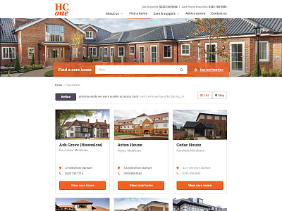
My role on this project was to lead the redesign of the dated, unresponsive HC-One website that was created back in 2011 after the foundation of the new company. The aim of the redesign was to increase the percentage of self-funded residents, improve occupancy and attract high quality candidates for vacancies.
As HC-One wanted to make the new website fully responsive, I opted for the ‘card’ layout approach which provides HC-One with the ability to display more care homes on one row on larger screens, which presents the user with more results, which could help them to find what they’re looking for a lot quicker. The card layout also makes the care home information easier to digest on smaller screens.
I also used large, bright call to actions to prompt the user, I also created easy to digest care home information pages with quick and easy access to resident enquiry forms, which should reduce the volume of calls and increase online interaction.
Let's hope this helps!
