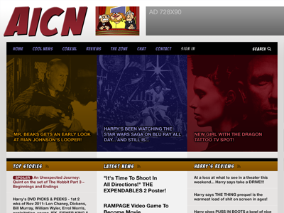
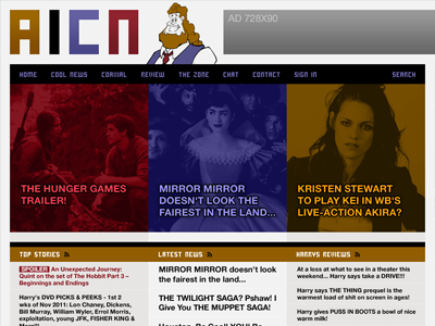
Ain't It Cool News : Redesign - Home Page 0.002
Harry Knowles himself tweeted my previous shot to his readers:
https://twitter.com/#!/headgeek666/status/137425877632954368
I tracked reader feed back (mostly positive) and notes
https://twitter.com/#!/Colin_Hanks/status/137462558306205696
The biggest gripe from people was the pixel font. Others missed the gif animated short thats a signature part of the current site. The first was a design choice and the second was always intended to be there.
The cleaner layout was a hit even with detractors. What I found funny was people thinking I had changed the color pallet, when i had gone out of my way to use the exact colors of the current site.
This rebound reflects those suggested changes among many other small refinements.
More by Free Reyes View profile
Like


