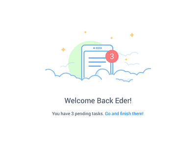
Doable - Welcome Back screen
I'm always trying to learn more about coding, even when I don't code for a living. I have so much respect for developers that I don't feel good enough to perform their work. Considering that, some people asked me in the past; why are you learning how to code, if you're not going to code in a product? And this screen is a perfect example and a perfect answer for that.
When I was building this product, I found a blocker. It's a little bit complicate to explain but in few words; when the state of the user was still as signed in, when their sessions still don't expire, and the user type the root URL (www.todoable.co) in the browser, in a new tab for example, they were seeing the landing page, because is the root screen in the rails routes.rb file, showing the top-nav of a signed user. I'm sure it was a really easy to solve bug, but I saw that blocker as an opportunity analyzing that context. If the user is typing the URL after a short period of time, probably is because they want to continue working in their tasks or they forgot to complete something. So it was a good scenario to show them a warming "welcome back message", with the number of tasks they have as pending, as an attempt to show them that the app understands their behavior. That's also design! Without knowing how to code, I would not be aware of scenarios like this one.
If you have the opportunity, go to the website (www.todoable.co) and try it, also has a nice animation! In the attachment is an example of the illustration that appears me in my current account, which reminds me that I have a lot of pending things to do!

