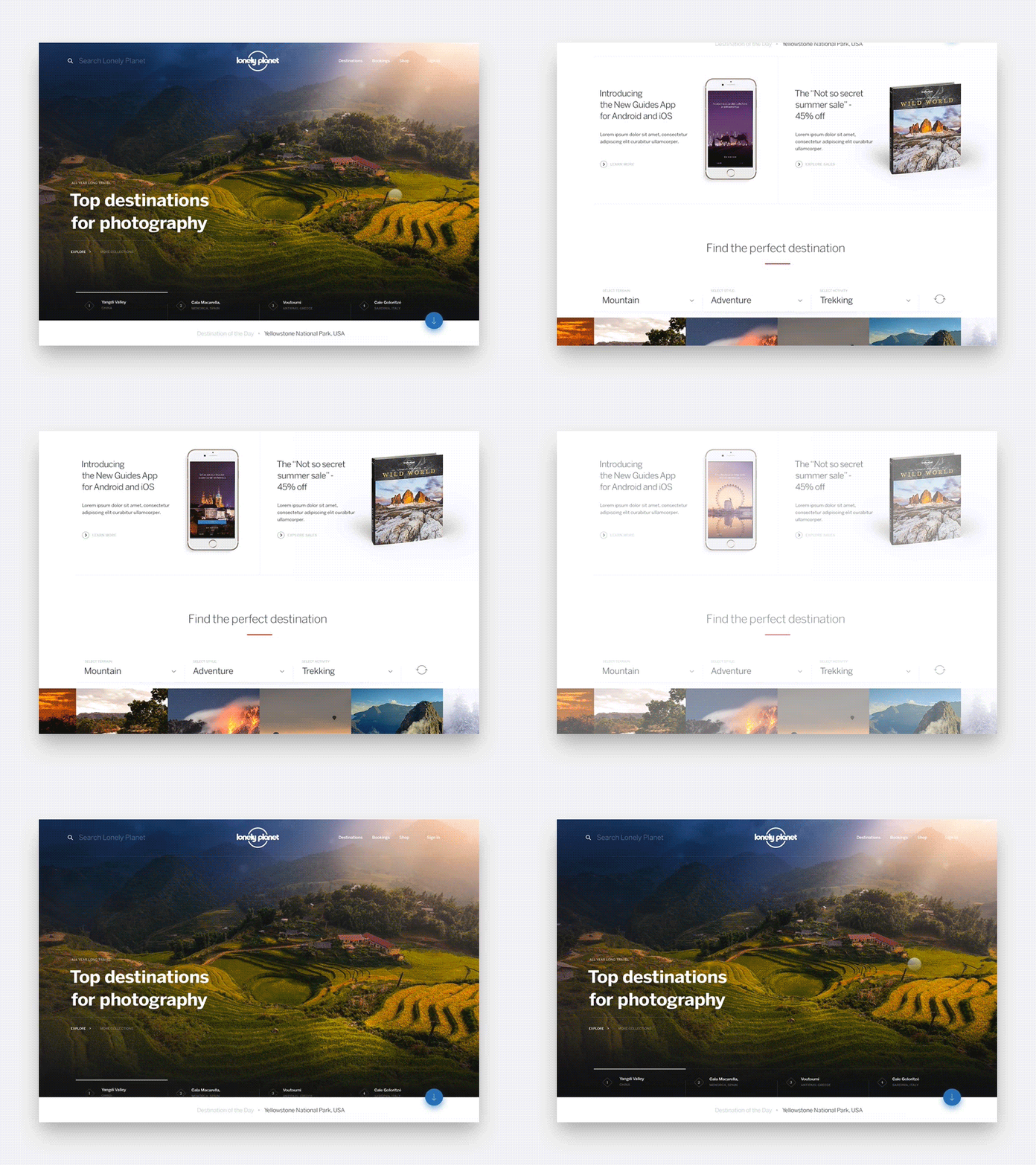
Lonely Planet HP - Marquee exploration
Hi friends,
Last year I briefly collaborated with my friends at Lonely Planet to design their new Home Page. I can't emphasize enough how amazing is to work with these guys (special mention to the mighty @Brad Haynes ) and the amount of work they had already done before I jumped in.
My explorations were pretty much focused on the general execution of the layout / content density, the motion users see when they first land and some other micro interactions on hover or scroll. As always I used @Framer for the interactive/motion part.
I'll continue posting more details this week. Check the attachment for a smoother animation.
lp_homepage_marquee.mp4
9 MB
More by Lonely Planet View profile
Like
