3drops refinement

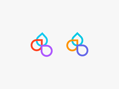
I noticed that the @3drops logo has slightly offset and rotated forms, and it seemed an interesting opportunity to test how it might look with everything properly aligned. I also adjusted the colors to have slightly less contrast.
I noticed that the @3drops logo has slightly offset and rotated forms, and it seemed an interesting opportunity to test how it might look with everything properly aligned. I also adjusted the colors to have slightly less contrast.