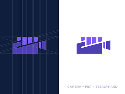
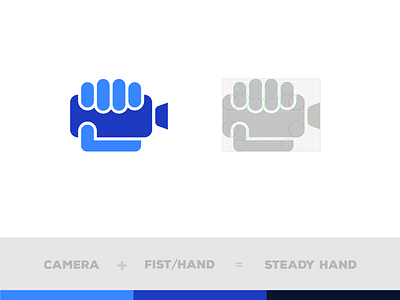
SteadyHand
SteadyHand - Logo proposal.
I've been working on this identity mark for a long time now and made some different execution directions so far. Check attachment for the other variations.
Personally I feel this is the best so far. Where I take care of the 'sausage' reference with the extra lens element in between. Also kept the whole mark sharper and bolder in overall.
Concept explanation:
The fist was part of the client wishes to use within an bold, not super modern visual. Because they work with cameras I included a camera in here (more old version) and the fingers can also refer to buttons of this camera.
Open for all feedback, love, hate everything! :)
More by Jeroen van Eerden View profile
Services by Jeroen van Eerden
Like


