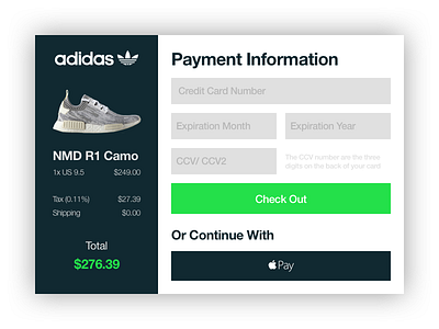
Credit Card Checkout Modal
Day 2 of the Daily UI challenge was to design a credit card checkout page/ form. Decided to go with a simple, yet heavy, Adidas style checkout form for a shoe.
I spent a little over my 1 hour limit, mainly because I had to trim away the background for the picture of the shoes. Apart from that I managed to stick within my limit.
Looking back, I'm not 100% satisfied. It could do with some more whitespace, and smaller elements. Also I'm not sure about the sidebar, I could've done something way cooler but I just don't know what. Hopefully it'll come to me more easily after I'm done with this challenge.
Let me know your thoughts and suggestions, I'm very eager to learn!
More by Aleksander Skjoelsvik View profile
Like
