Guida & Nena
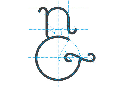
Sketch of the grid for G&N logo , the goal would be to see an old & (Et) but also read the 'n' and the 'G'...hope you like! In flickr I have other sketches that I created for this logo at the beginning of the year (we stopped the project since now) http://www.flickr.com/photos/adriancervoni/5514876885/
More by Adrián Pérez View profile
Like
