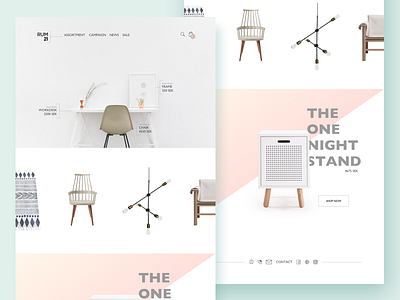
Redesign of Rum21
Hello!
I did an evening excersise redesigning a swedish website called rum21.se!
Because they sell high end furniture I wanted the site to look high end too. Exclusive and neat.
I quickly redesigned the logo too to make it more minimalistic.
Tell me what you think! :)
(The furnitures used in the picture are to be found for sale at rum21.se and the picture at the top i found at Unsplash and the icons are from: http://www.flaticon.com.)
More by Miranda View profile
Like

