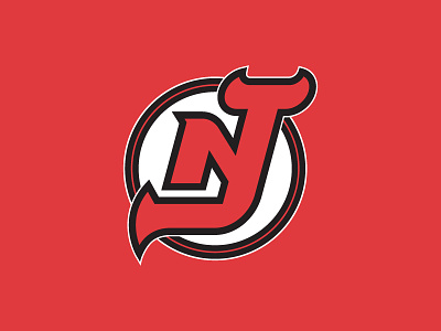
NJ Devils
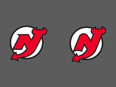
I've been wanting to do a take on the NJ Devils logo for a while and after going to a few games this season + seeing a take on it by @Matt Kauzlarich - I wanted to do an exploration of my own to clean the logo up! On the left is more of a straight edged approach and on the right is a little closer to what they currently have with my modifications to try to make it read and flow better. Let me know what you guys think!