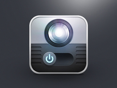
Flashlite Icon
Another throwback!
This is from back in the day, when iPhones needed custom apps to be able to shine the flashlight on the back at will! 💡
It's also from the era when skeuomorphism was king... so it's an abstraction of what a flashlight would look like if it was in the shape of an iOS icon.
I still like it. I was inspired by the Instagram logo 📸 at the time (R.I.P.) which was one of the last famous skeuomorphic icons to survive the move to flat design. Now of course they've changed it to a glyph.
I feel like these more physical icons gave a good feeling, like you owned a tangible product. On the flip side, this is not easily spotted on your home screen, and not even recognisable at small sizes. Still, will be interesting to see if some of these physical elements return in the future 🤖.
