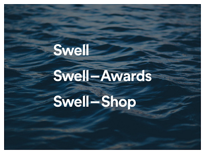
Swell logotype revised + sub-brands
The first version of my Swell logo never sat quite right with me and I wasn't sure why. Once I got to developing the logos for these sub-brands "Awards" and "Shop" there was more I wasn't liking and I new a subtle change of direction was required. The old version was based on Proxima Nova, and I wasn't digging the lowercase "a" or "d" very much.
This new one is based on Circular with some modifications. Ascenders and descenders have angled ends. "S", "e", and "a" have been opened up a bit to read better at small sizes, and so the first "S" sits better with the "w".
I'm really happy with how these are looking now.
Thoughts?
----
I'm available for new design projects.
Need a design partner? Contact me at benek.nz
Follow me | Website | Behance | Pinterest | LinkedIn | Twitter
