Los Angeles Chargers Logo
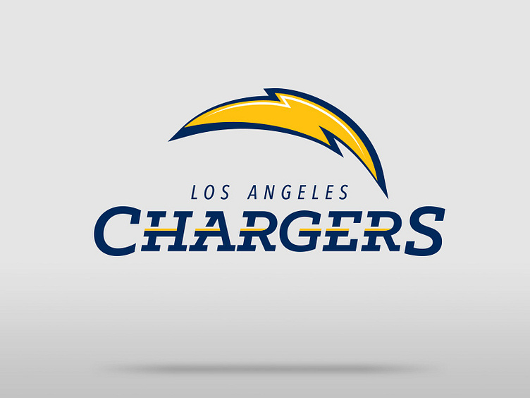
Figured I'd toss my take on the Los Angeles Chargers logo redesign.
I went with a serif font to give a nod back to the original LA/SD Chargers logo, but kept with the yellow horizontal lines within the letters from the current mark. The bolt is actually taken from the existing bolt, but I removed the 3rd piece, and stylized a little to give it more energy.