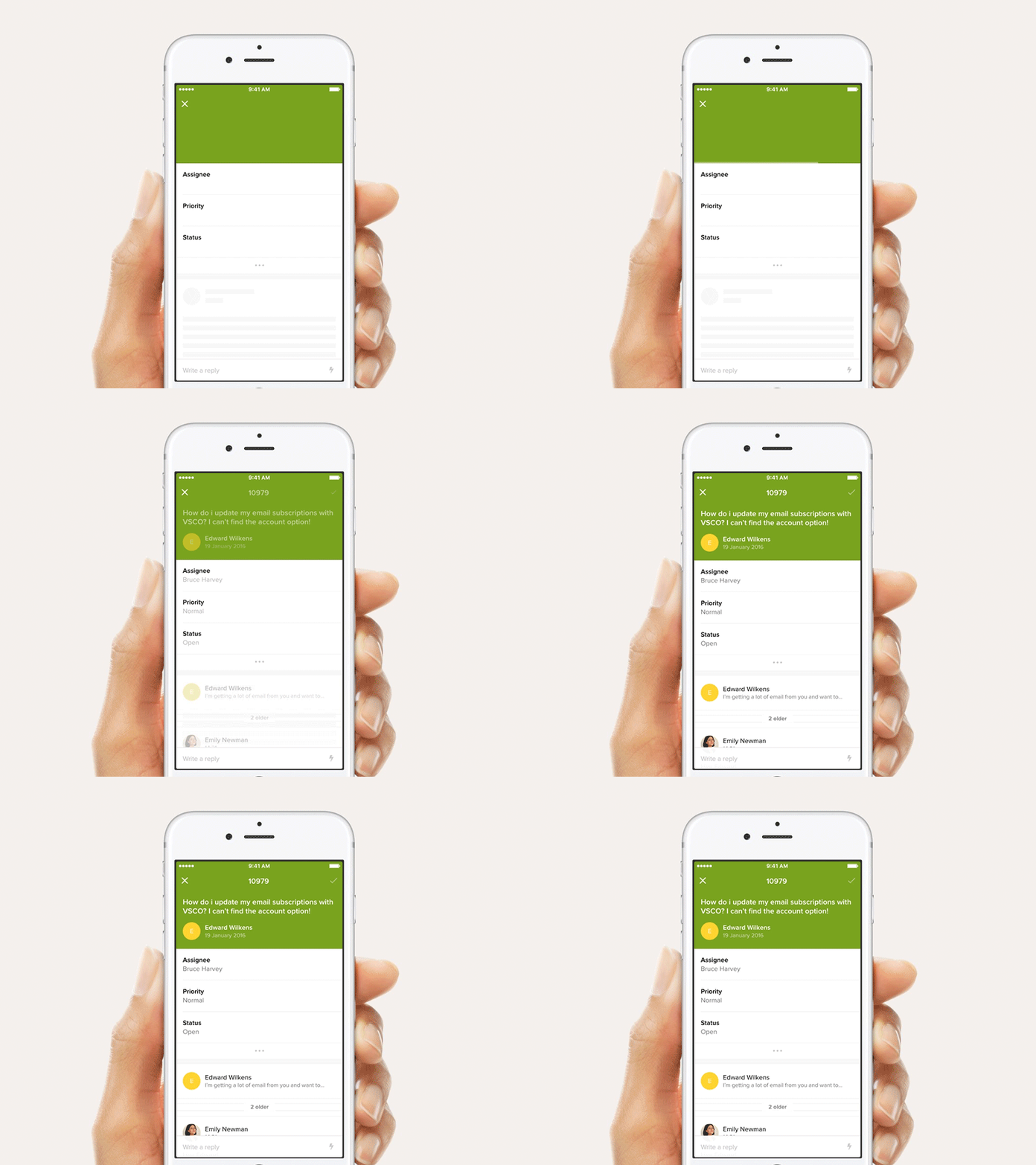
Ticket loading animation
The team worked really hard to make sure this is seen as little as possible. But when a load state is needed we wanted the experience to be as natural as possible.
By keeping known content visible on screen, while some subtle UI skeletons lead the eye the user knows what to expect and where to expect it.
More by Zendesk View profile
Like
