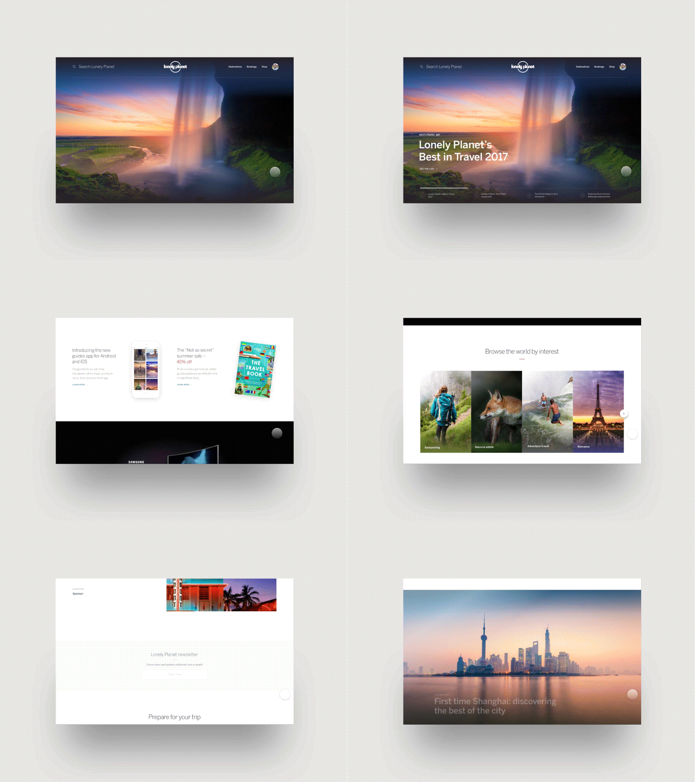
Lonely Planet homepage
Research showed us our best content wasn’t as discoverable as users expected. To improve this, we redesigned our homepage in a way that spotlighted top articles and interests in a more pronounced way. This is another piece of a foundation for a lot of awesome stuff to come.
Check out the attachment, as well as the live site:
www.lonelyplanet.com
Huge thanks to @Claudio Guglieri who worked with us on this!
More by Lonely Planet View profile
Like


