Champion: Reworked

Hello guys,
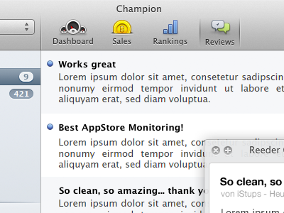
frontend has been redesigned to be "easier" on the eye. My old design was a little bit too much for a utility app. Since we hope this will be used quite often, I wanted to stick to the HIG and got rid of the "fancy" stuff.
Keeping it simple yet usable with the right amount of Informations is what I am aiming for.
I'm not quite sure about the "big" icons, although Apple's HIG suggests this kind of Element for switching tabs, I'm not sure if it still fits the nowadays UI's.
Feedback welcome!