Credit Card Checkout
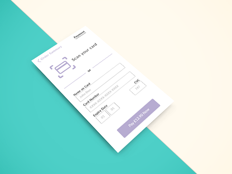
Following good usability standards for payment pages I made sure the CTA text made it clear to the user what will happen when they click it.
By incorporating the total cost into the button the user cannot be mistaken at how much they are about to spend.
During the final stages of the checkout process all other distractions to the user must be eliminated. Therefore on this page there is only two actions the user can take; pay or go back to the order summary page.
K. x
