Vertical rhythm in typograhy
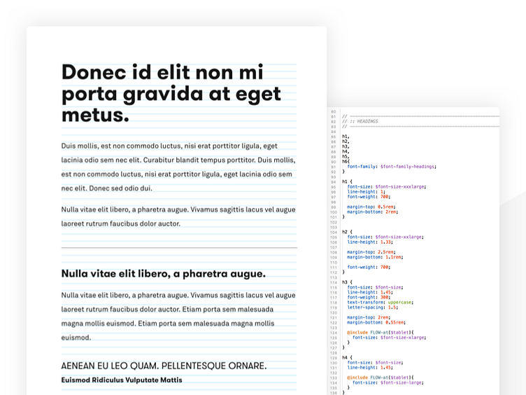
I've been experimenting with vertical rhythm in typography achieved through CSS and I'm pretty satisfied with how this turned out.
It feels very balanced, yet still flexible enough to expand upon in the future. Everything is based on a base font-size, which makes it really easy to re-use for different font-sizes, without losing the nice rhythm between the different elements & sections.
More by Little Miss Robot View profile
Like
