Logo Timeline
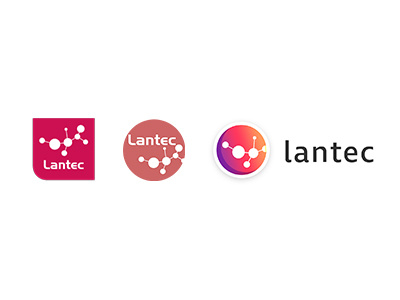
For the company I work at, the logo has gone through 3 changes over the years. Here's how its progressed and developed from left to right.
I've kept it's bright colour from the first one but the text was taken out of the circle to create better space for websites and sponsorship. I also added a shadow round the circle icon to make it look like its a sticker and helps it stand out.
More by Joanne Edwards View profile
Like
