Zolidwork Logo

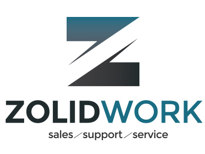
ZolidWork wanted a logo with solid, heavy colors and expression. I made the Z-symbol with their main color blue along a dark, concrete gray at bottom to illustrate a heavy base, and to make a symbol that works as a stand-alone as well as with the logotype and tagline.
The logotype was made with the same colors, using a bolder typeface on the word "zolid" to emphasize it's meaning.
A requirement was to include the tagline "sales, support & service" on larger versions of the logo. I made a separator using the same angle as the cut-through in the Z to endulge consistency, and use the separator to lead the readers eye (their customers mainly operate in europe, where standards are a top-left-to-bottom-right direction of reading). The separator leads the eye from the bottom right of the word to the top left of the next, easing transition when reading.