Artist Union Redesign


One thing I love as a designer is randomly picking sites that I use and trying to make them better.
It’s pretty bad ass being a designer, instead of interacting with a site I find myself hovering over buttons judging font choices/colors and when I don’t like something I have the power of redesigning it.
I chose to redesign a few pages from theartistunion.com because I really like what their doing with supporting undiscovered artist, I can only imagine how tough it is to try and get discovered as a music artist in a world full of noise, so kudos to those guys for making it easier.
You can see in the attachment of how AU looked before and which screens I pulled content from.
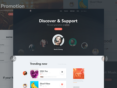
For the homepage I wanted to have more of an attention grabber top section, however I like the idea of the carousel on top, so stuck with that. I also wanted to bring more attention to the peeps posting the music so made there avatars larger. Went with a bold in your face font type and added some texture to bring the empty space out a bit.
For the promotion page I wanted to make it’s simple, easy to follow but as informational as a user wanting to sign up would need it. I also wanted to showcase what AU does to promote it’s artists, if/when a users song gets posted. You can also see what mobile would look like for the feed.
See the attachments for the full sizes | comments & likes always appreciated!