Stats badges inconsistencies
Nice work Jason, it looks awesome. I couldn't help but notice a few inconsistencies though, I hope you don't mind me pointing them out.
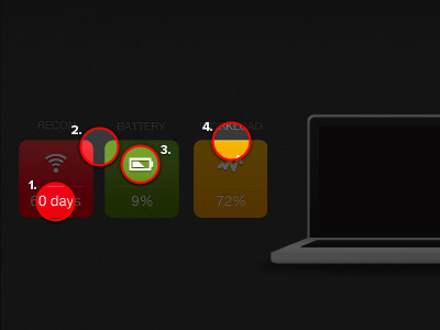
1, 9 - Text doesn't have a shadow applied like the others do.
2, 4, 6, 8 - The rounded boxes need sharpening, if you look closely there are more that could do with sharpening.
3, 7 - Icons could be sharper.
5 - Shadow is missing from the icon.
More by Danny Keane View profile
Like

