Tubik Studio | Vinny's Bakery Interactions
Hi dribbblers!
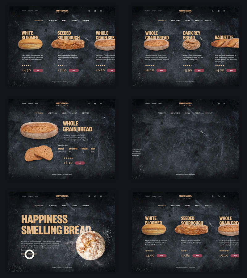
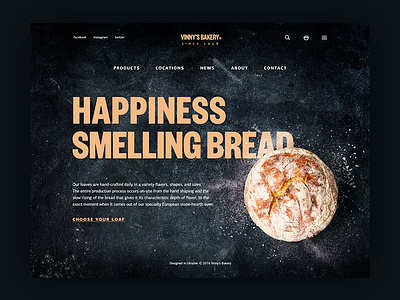
Here's a new shot from me smelling fresh home-made bread. Perhaps, you remember my previous concept presenting design of a website for the bakery selling bread and pastries online. Here is the extended animated version featuring interactions with the website: home page, catalog of offers and the page presenting a particular position. Traditionally, I followed the philosophy of minimalism which is user-friendly, attractive and informative. Check out HD version in MP4 video attached.
As earlier, I would like to invite you into discussion. This concept applies horizontal scrolling — what is your opinion about this sort of technique for e-commerce websites? Do you find it effective and applicable for this particular case of design? Your opinions are highly appreciated.
To share more ideas we get working on design projects and concepts, we regularly update Tubik Blog with new articles. One of the latest articles presents a bunch of Tips on Applying Copy Content in User Interfaces . Welcome to read!

