Stats Page - unused (V2)
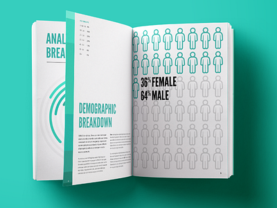
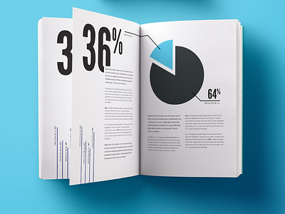
This was a 2nd concept I created for a stats page. I do like it but I think it requires the reader to actively read or look for the information rather than it being clear from the start.
I say this because the green bar down the left page is visualisation of the age group breakdown, which isn't really apparent on first glance.
Still let me know what you think :)
More by Dean Harrison View profile
Like

