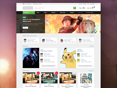
New Homepage
A new homepage.
Final design for the Trading Card Game homepage.
Our client's short and medium term goals requires a revamped and completely responsive website. Our analysis shows their current site gets a higher return visitor rate in mobile, and they have around 50% less conversion rate vs. desktop. These habituated users are not getting an experience to aid their fact finding use case and support purchasing.
We started this redesign by creating a dynamic library on sketch app, based in their brand guidelines with components using the atomic design approach. That way our UX team was capable of developing the UI mockups of every necessary section such as: homepage, categories, product detail, dedicated brand landings, checkout process and more, without lossing consistency.
The focus was to create a new interface that feels light, modern and flexible.
Full view here.
We've came up with a set of patterns with subtle shadows and small rounded corners, just like the Cards from Magic: The Gathering, Pokémon and Cardfight!!.
Kudos to my team @Michael Pons, @Ola Drachal and @Vanessa Ferro for their hard work on this awesome project.
We'll be showing more soon.
Stay tuned.
–
Created with PG's Product Design team 😉.
Do you have a new project for us? Let's talk.


