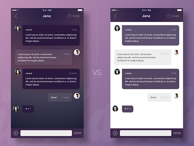
Chat design for iMatch
Hey guys!
Need your advice!
Which version is better? I know white background is easier to read on, but at the same time I like the dark version more...
What do you think? Looking forward for your comments and 💛
More by Tatiana View profile
Like

