Dribble Designs
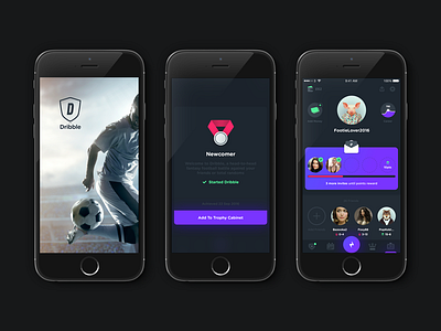
Some assorted screenshots from the Dribble fantasy football app (playdribble.com). Some of these designs ended up in the app, some are just internal drafts.
The primary issues with Dribble from the start were UI inconsistencies, muddy gameplay instructions and some disappointing conversion dropoffs from install to registration.
UI inconsistencies was the first task, and the whole app was taken apart and re-designed based on the original UI. Along the way a living styleguide was created to keep things visually uniform in a UI library. Purple was chosen as the primary colour to give the app a bit of personality and playfulness.
After the app was refreshed/re-designed, the next priority was a conversion issue where too many users dropped off before completing registration. The problem was identified through user testing as too many hoops to pass before being able to actually play the game properly. Many users also didn't really understand the rules and mechanics of the game when starting out.
The whole onboarding flow was therefore re-designed so that new users were immediately thrown into a contextual tutorial flow in which they did not have to register an account to play. They played games as guests, only prompting them to sign up once the game had been explained fully and they had played a handful of games as part of an achievement-based tutorial.


