Trello Atlassian - Redesign
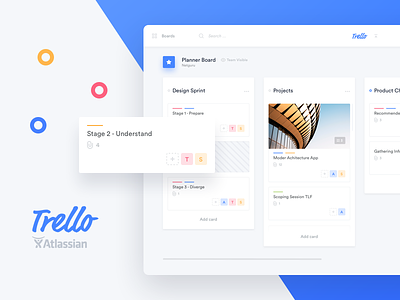
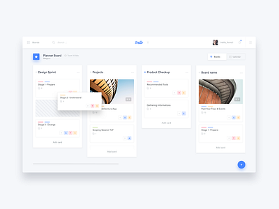
Are you a Trello lover just like us? Take a look at our attempt at a Trello redesign, which we created in response to the community's concerns after Trello's acquisition by Atlassian. The main layout got a new colour, and the cards look a bit better. We also added navigation tabs which make it easier to switch between the main view and the calendar. Take a look at the full redesign case study on Behance.
If you like it, read our open letter to Atlassian and spread the word. Let's make Trello great again.
---
Show us love! Press "L".
Want to see more projects? Visit our profile and remember to follow us
Learn more about our approach, read How to Talk to Designers About Design: Tips for Non-Designers.
More by Netguru View profile
Like

