Paypal: Art Direction
PayPal: Art Direction
In the fall of 2016, we were asked by PayPal to help design a custom 110” (diagonal) multitouch experience.
After spending a lot of time trying to wrap my mind around how to design for such a large experience, I was excited to work out how a UI could communicate and organize everything the client needed.
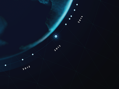
Above is a small piece of the UI at 1/2 resolution (seriously, 110" is a huge display). Attached is a 1/2 resolution export of the UI design. The screen shown here is a touch timeline of PayPal's history. On the right is a filter for event type categories (which also acts as a legend for the color coding) and the upper right is reserved for copy and a variety of graphs (more on this later!).
Fun fact: the wireframe background asset was generated in Processing and a direct leftover of the original exploration in code.
All feedback is welcome.
----
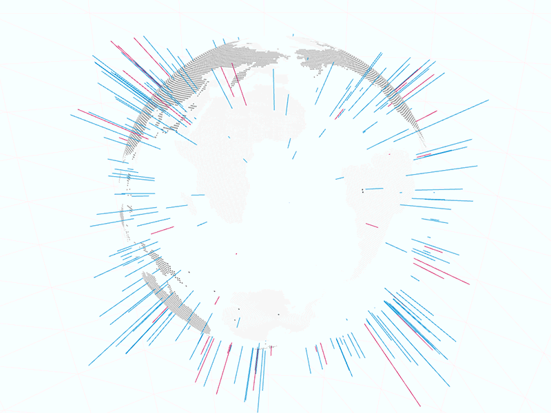
Further globe art direction and motion exploration by Jim DeBrock (https://dribbble.com/jimdebrock). And further coding, design and data explorations by Wes Pearce (more on this later because it's really awesome!)
More of the final build was shown here: http://www.cbsnews.com/news/paypal-command-center-cybertheft-prevention-cyber-monday-san-jose/ Note: We were not responsible for the final build, only design direction and prototyping.


