Ampersand 2017
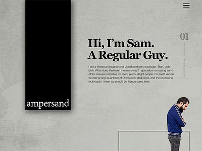
I launched my new website in 2016, and like all of us, I already want something different. This is a mockup of something I'm working on. Less professional, but way more in line with my personality. What do you think? I'd love some feedback. Be critical, so I can make this even better! Full shot attached.
Check out the current site http://madebyampersand.com and tell me which you like better.
More by Sam Daugherty View profile
Like

