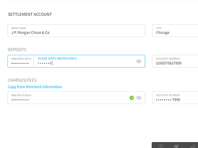
Form validation
This is an example of the approach our team took with form validation in order to save space and more importantly have a fluid and quick flow for the user when validating.
Side note: We did not have the freedom to design a new navigation for this product just yet so that combined with the fact that it is a private client is why you see a blurred bar at the top :)
More by Meaz Hajdarovic View profile
Like


