SimOnly Discount
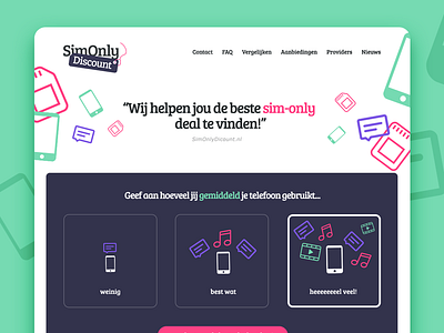
Just finished a smaller freelance project for a Dutch SimOnly-comparison website. They needed a fresh new brand & interface that's a bit different then their competition. The idea was to start with a simply three-button suggestion tool to start from. Afterwards users can filter the suggestions by SimOnly Discount.
More by Ricardo de Zoete View profile
Like


