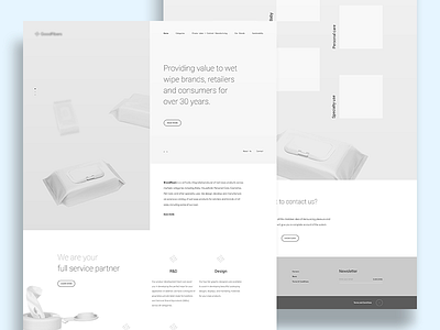
Homepage wireframe
A glimpse of one of my recent projects, a site for a… wipes manufacturer. What you’re seeing is the initial approach, based on a lot of parallax scrolling and other bells and whistles, which unfortunately proved to be a tad too avantgarde for the client – I’m currently working on simplifying it, but I’m pretty happy about it anyway so decided to show it off.
Also, this is my debut shot for Tonik, yay!
More by tonik View profile
Like

