Prism
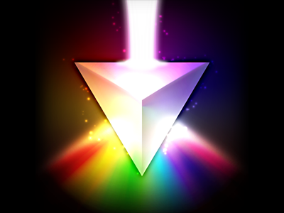
So the brief is an iOS icon that conveys the multi-faceted nature of the app by way of a prism, and incorporating a rainbow was more or less a direct request. Oh, and also not to make it look like Dark Side of the Moon.
Not convinced about the way the rainbow splits out at the bottom, but this is just a first draft.