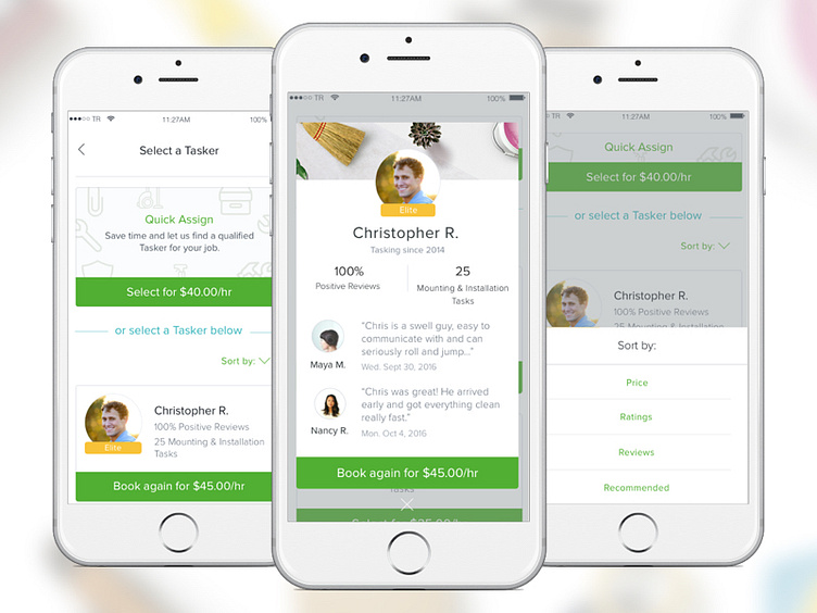
Select a Tasker
Refreshed Tasker recommendations on the client iOS app. Our "Quick Assign" option (where a user doesn't select a Tasker) is now differentiated and becomes small and anchored to the top of the viewport on scroll. It's visually stylized separately so that the user understands they have two options on this screen. The screen allows two cards to be viewed at one time because we found that 1 at a time created a poor and long experience, yet any more than that became overwhelming.
Additionally, each card can be tapped on to reveal more information about that Tasker/option. Both areas have a CTA to allow the user to move forward. User testing showed that clients considered quantitative stats and reviews the most when selecting their Tasker.
More by TaskRabbit Design View profile
Like
